I’ve been painting again recently, so I want to display them here, even though they are not professional photographs. One day I hope to either have the ability to photograph my own paintings, or pay someone to do it, so I can make them available for downloads and prints. For now, this will have to suffice.
The featured image is one I very well may call Ballmer Peak after the XKCD cartoon, because I was somewhat drunk when I painted it. It’s the only time I’ve painted under the influence of anything other than cannabis, and the result surprised me. It’s one of my more vivid paintings, and one of my favorites now.
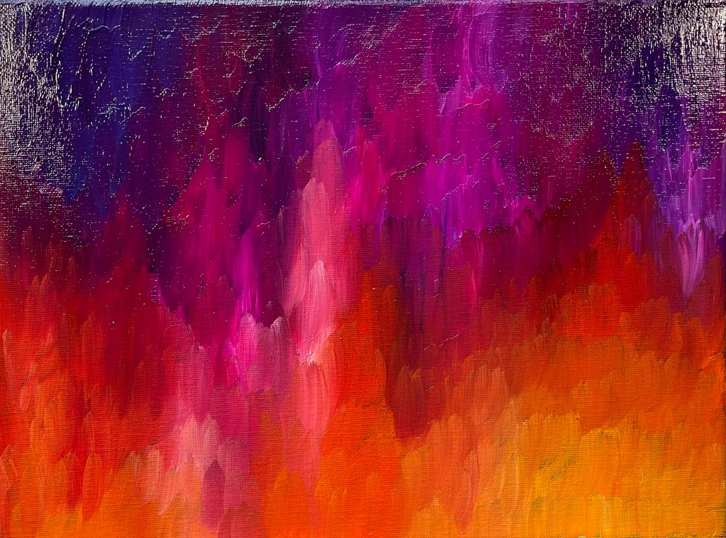
Despite the cool tones at the top, I include this one in the “Studies in Warmth” because of the fiery tones at the bottom. They really stand out.
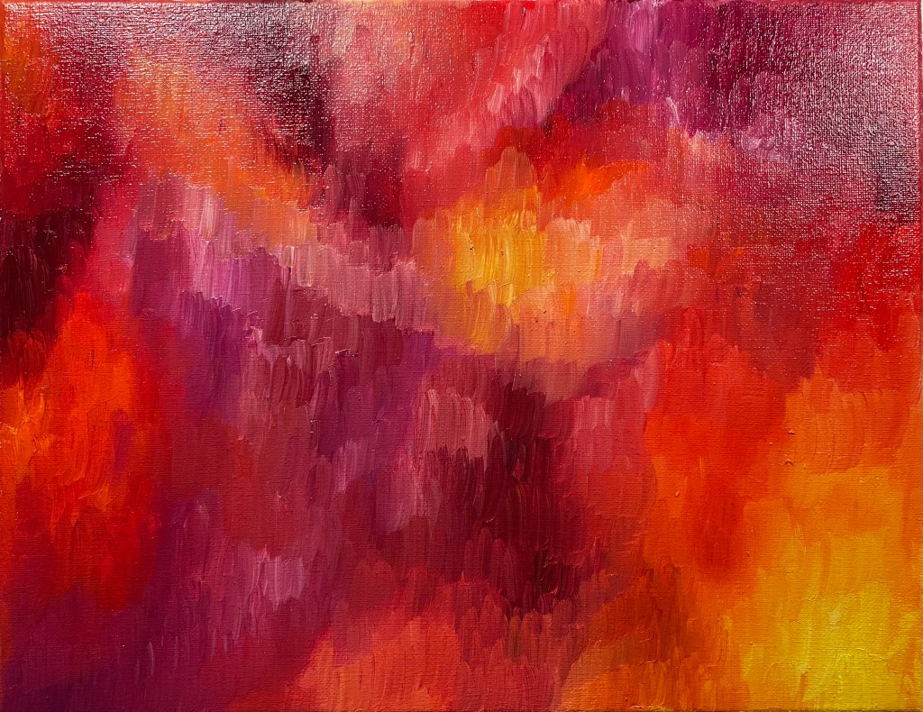
Then the other day I did this one, which I intended to be just a general study in warmer tones, so it spreads from yellow all the way to reddish-purple. I’ve noticed a trend in my paintings to put purplish tones in contrast to fiery tones, just as with the upper painting. I’ll have to analyze my personal color psychology to figure out what that means.
I’ve actually tried to get away from painting in warmer tones because they represent the mental turmoil of my life for the last few years. Blues and greens are much calmer in feeling, and so I focused my attention on painting more in those tones, which I will feature in my next post.


Leave a reply to Xephyr Cancel reply